Page History
...
| Tip |
|---|
In the Server Details view, click the Maximize button on the upper-right corner of a chart to display a large version of the chart. The Restore button returns the chart to the default view. |
All-time charts in the web console and desktop console have time-range drill-down functionality modeled after SQL Workload Analysis.
- Click on your preferred graph and hold the left mouse button.
- Drag to the left or to the right.
- Release the mouse button.
The time range selected with the previous steps is the new display history range on all the graphs displayed on different tabs.
...
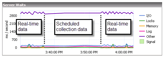
SQL Diagnostic Manager charts provide data whether collected in real-time or as part of a scheduled collection event. When you open a view, SQL Diagnostic Manager begins populating the chart with real-time data collected on the interval specified in the Server View Refresh field on the Console Options window (Tools ![]() > Console Options).
> Console Options).
If you pause or leave this view and then return during the same Console session, SQL Diagnostic Manager displays the real-time data points as previously viewed, followed by a period of data points from any scheduled collections that occurred while you were away. The chart then returns to populating with new real-time data points, as shown in the following image.:
The amount of time displayed in your charts is set according to the time entered in the Show data for the last field on the Console Options window. In addition, the time entered in the Keep data for the last field is the amount of historical data that you can scroll back to in your charts The displayed data is determined by the last range selected in the top right corner drop-down.
Customize your charts
SQL Diagnostic Manager contains charts that are populated by selecting the appropriate data items collected. Once populated, you can manipulate the type of chart you want to display and export the chart or copy it to the clipboard to paste into other programs.
...
The Palette Selector menu includes a number of color choices for you to change the color scheme of your chart.
...
The Axes Settings menu lets you choose how to view each axis, whether to display labels , and additional properties for your view.
...