Page History
The Load Chart is located on the top section of the Profile Session editor and provides a display of the overall load on the system. The bars represent individual aspects of the enterprise, and the view is used to discover bottlenecks.

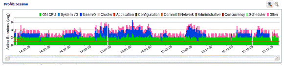
The most important part of the previous screenshot is the Average Active Sessions (AAS) graph. AAS shows the performance of the database measured in the single powerful unified metric AAS. AAS easily and quickly shows any performance bottlenecks on the database when compared to the Max Engines (for Sybase) or Max CPU (for Oracle) the Max CPU line. The Max Engines line is a yardstick for performance on the database. When AAS is larger than the Max CPU line, there is a bottleneck on the database. Bottleneck identification is that easy.
...
- Time is displayed on the X axis. You can zoom in and zoom out on the graph via the icons in the upper right hand corner of the graph, once a profiling session is stopped.
- The Y axis shows the average number of sessions waiting or executing. Each supported platform has a specific set of wait event times.
| DBMS | Wait Event Category |
|---|---|
| IBM DB2 | Fetch, Cursor, Execution, Operation, Transaction, Connectivity, Lock, Other |
| Oracle | On CPU, System I/O, User I/O, Cluster, Application, Configuration, Commit, Other |
| SQL Server | CPU, Lock, Memory, Buffer, I/O, Other |
| Sybase | CPU, Lock, Memory, I/O, Network, Other |
* A chart legend displays a color and code scheme for executing and waiting session categories, in the upper right-hand corner of the view.