Charts are populated from the point at which you navigate to the window with the chart. This allows you to view real-time charts for the data point selected. Real-time viewing is dependent on your refresh interval. Once populated, you can manipulate the type of chart you want to display and export the chart or copy it to the clipboard to paste into other programs.
In the Server Details view, click the Maximize button on the upper-right corner of a chart to display a large version of the chart. The Restore button returns the chart to the default view.
Understanding your chart data and refresh interval
SQL Diagnostic Manager charts provide data whether collected in real time or as part of a scheduled collection event. When you open a view, SQL Diagnostic Manager begins populating the chart with real-time data collected on the interval specified in the Server View Refresh field on the Console Options window (Tools > Console Options).
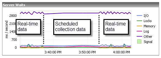
If you pause or leave this view and then return during the same Console session, SQL Diagnostic Manager displays the real-time data points as previously viewed, followed by a period of data points from any scheduled collections that occurred while you were away. The chart then returns to populating with new real-time data points, as shown in the following image.
The amount of time displayed in your charts is set according to the time entered in the Show data for the last field on the Console Options window. In addition, the time entered in the Keep data for the last field is the amount of historical data that you can scroll back to in your charts.
Customize your charts
SQL Diagnostic Manager contains charts that are populated by selecting the appropriate data items collected. Once populated, you can manipulate the type of chart you want to display and export the chart or copy it to the clipboard to paste into other programs.
You can personalize charts by right-clicking anywhere inside the chart and selecting Toolbar from the menu. The chart toolbar contains the following options:
Copy To Clipboard
The Copy To Clipboard button allows you to copy the chart to your Windows clipboard in various formats.
The Print button allows you to print the chart.
Gallery
The Gallery menu includes a number of options that allow you to change the type of chart used to represent your data.
Anti-Aliasing
The Anti-Aliasing button smooths the lines between your data points to more easily view your data.
Palette Selector
The Palette Selector menu includes a number of color choices for you to change color scheme of your chart.
3D/2D
The 3D/2D toggle lets you choose to view your results in three- or two-dimensional plots. Additional options become active based on your choice and allow you to rotate your view or cluster your results on the z-axis.
Axes Settings
The Axes Settings menu lets you choose how to view each axis, whether to display labels, and additional properties for your view.
Point Labels
The Point Labels toggle lets you choose to view the actual data at each point.
Data Grid
The Data Grid toggle places a table below your chart that displays the data included in your chart.
Legend Box
The Legend Box toggle lets you choose to view a legend for your displayed data.
Zoom
The Zoom button allows you to zoom in on a point in your chart.
Properties
The Properties button displays additional properties for further customization of your chart.
SQL Diagnostic Manager identifies and resolves SQL Server performance problems before they happen. Learn more > >